In this article: the graphics, effects, interface, general performance and the map.
Graphics
A lot of cold water was poured on Blizzard because of the “cartoon style” graphics and shiny coloring. By the looks of it the issue has been resolved. Red and Blue colors have been shaded and dimmed, resulting in a very cool effect which I like to call “The Starcraft Distress”, which basically is a darkish look that greatly adds to the excitement of the game.
The “Acid green” which you can see on a number of Zerg units and buildings, as well as certain Terran buildings is just awesome and overall the coloring is just about perfect.
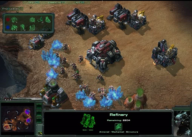
Bad news for the owners of High performance computers, as it appears the game doesn’t have Anti-Aliasing, even on the animation on the player interface, or at least it wasn’t demonstrated on both of the Battle Reports. However I should notice that lately AA has become quite rare, partially thanks to development of top of the line games for multiple platforms, and partially due to increasing performance demands.
It’s very important not to overlook one issue that at first appears to be not important when it comes to 3D strategy games, - viewing distance and corresponding effects. You probably noticed many cliffs, pits and gulfs on the map, some of which are filled with smoke, metal tubes, buildings, bones and even trees. All of that looks just great, interesting to notice but not at all distracting. Also these objects are often a good eye mark for a player who is fast scrolling around the map.
Effects
A whole lot of cool can and should be said about the effects. Every single building has a number of different motion effects, from turning fans to holographic shapes on Terran buildings to an insane number of living movement on anything that is Zerg including the creep, which looks like it has blood running through underground veins.
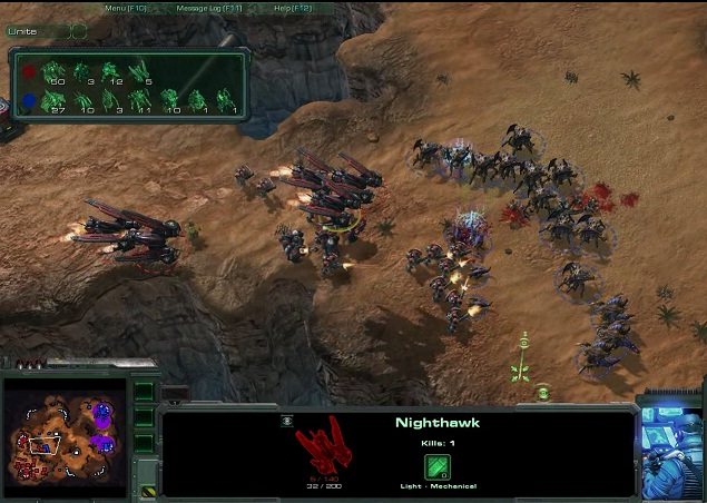
We are introduced to special map effect, - a sand storm. No complaint for the looks and realism, but it lacks smoothness, probably a sacrifice to keep the game frame rate up.
One specific thing that caught my eye is the effects of certain map objects. First of all the gas geyser, even the green smoke coming out of its little shafts has a shadow, second of all the trees that block viewing sight for ranged attack units, they very nicely fade when units are approaching, not at all blocking player’s view of his or his opponent’s armies.
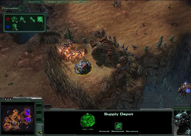
Another thing I want to pay attention to is blood and stains left on the map after unit’s death. Although the parts of the fallen unit disappear during the first 5 seconds after death, the stains stay on for over 30 seconds, and the shape of the stain can differ. Zergling remains including blood, if killed on the run, disappear almost instantaneously, but, if killed in frontal attack, not only stay for the good 30 seconds but also add up if multiple units were killed near the same spot. Zerg hatchery remains take 10 seconds to disappear, also pay attention to hatchery death animation, a small red heart keeps pulsating for the for mentioned ten seconds, to me that’s very creative.
Interface
Everything looks very familiar and yet modern and refined, the animated character, metal outlines, the text, selected units and even unit command buttons are just perfect, it’s a little bit lower than the original Starcraft’s, leaving more screen space for the action, it’s not at all distracting and at first look everything fits great, except for the small panel on top of the racial animated character, perhaps a thing of personal taste.
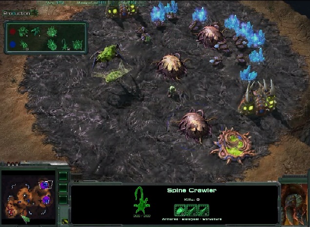
Once again in the upper left corner we have the tracker, quite similar to what Korean leagues offer during live broadcasts. It has several display settings, including Units, Production and Resources. While the first two are somewhat mundane, the Resources display caught my attention because the income is displayed in brackets next to the mineral and gas counters.
The Minimap hasn’t changed much since we first saw Starcraft II, to me it looks like a mix of Starcraft map and Warcraft II map, perhaps I am just too old to notice it, all in all I got no comments on it until we are demonstrated its features, if any.
Performance
General frame rate performance of the game is better than what we saw in show matches, there are much less hick-ups and frame drops (I found one - when Banshees destroy mutating hatchery), animation seems does not strand the fps, therefore – a good solid A for that.
The Map [Blistering Sands]
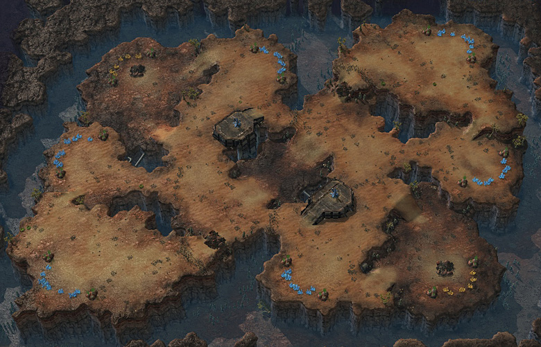
There is not much more I can say about the map design wise than I already mentioned in paragraphs above. From gamers’ prospective I can only add that mineral locations seem balanced, ramps, trees and rocks blocking back door ramp to the main bases also add to strategic aspect of it, Xel Naga towers, although not often used by players are a very nice addition too. Overall you have the sand, the rocks; dirt, narrow ramps and four expos, two of which with yellow minerals, so it’s shaping up to become an amazing one vs. one map.
Stay tuned for Part Two of the analysis, in which we will cover all the big in-game points, Units and Buildings, Design and Animation and the "CnC Conspiracy" as i'd like to call it.


![[Op-Ed] Women in competitive gaming – why are there so few?](https://static.gosugamers.net/8f/c9/2c/df69cf93db41c27a46978529e01614f38e0bfb80888132ac95fd3f89fb.jpg?w=1600)
