gosugamers
gosuentertainment
gosubattles
Games
Articles
Tournaments
Matches
Rankings
404
Page Not Found
The page you are looking for might have been removed, had its name changed or is temporarily unavailable.
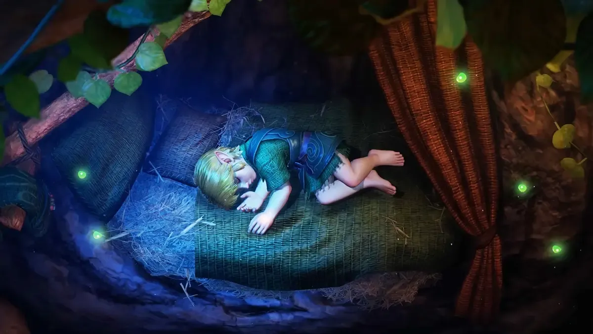
The Legend of Zelda Ocarina of Time remake announced for Nintendo Switch 2, launching in 2026
The Legend of Zelda: Ocarina of Time is officially getting a full-fledged remake.
Gaming
Timothy "Timaugustin" Augustin
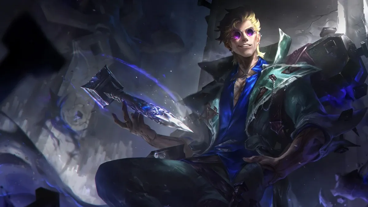
Locke the Ashen Exorcist arrives in League of Legends Patch 26.13
“Demons get a bad rap, but the real monsters? People.”
LoL
Anna Bernardo
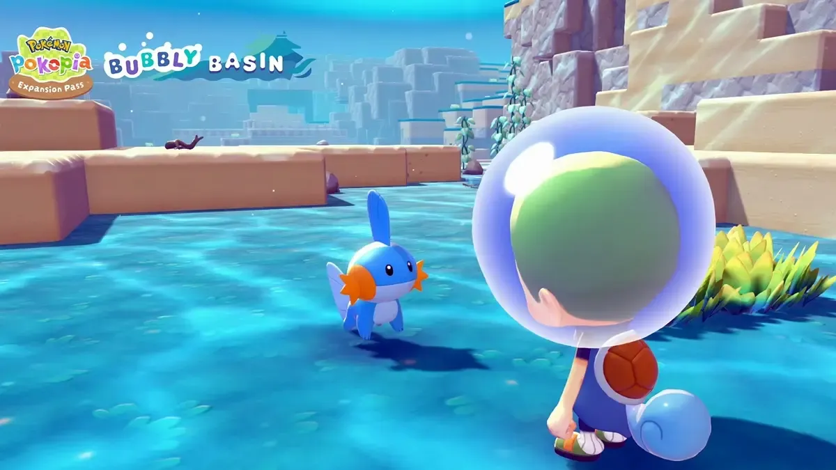
Pokemon Pokopia announces Expansion Pass with a trio of DLC, free diving update in August
Pokemon Pokopia players, it’s time to revisit your towns.
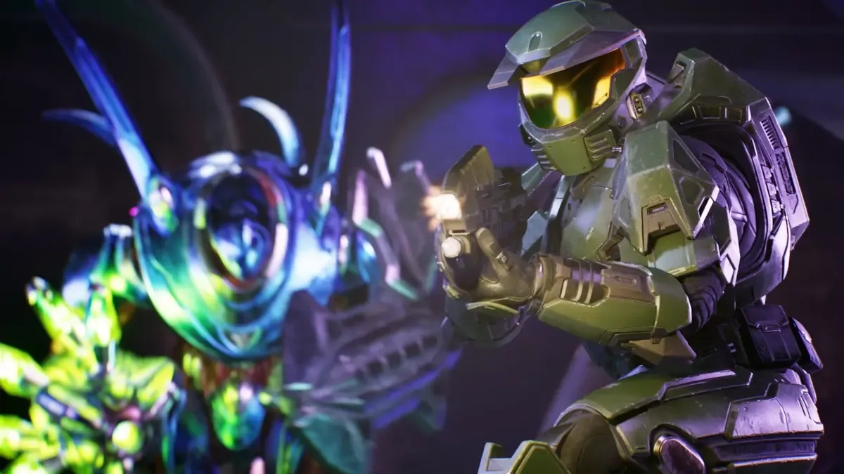
Halo Campaign Evolved remake's new trailer reveals PS5 Pro footage, Collector's Edition details
The upcoming Halo: Combat Evolved remake is upon us.
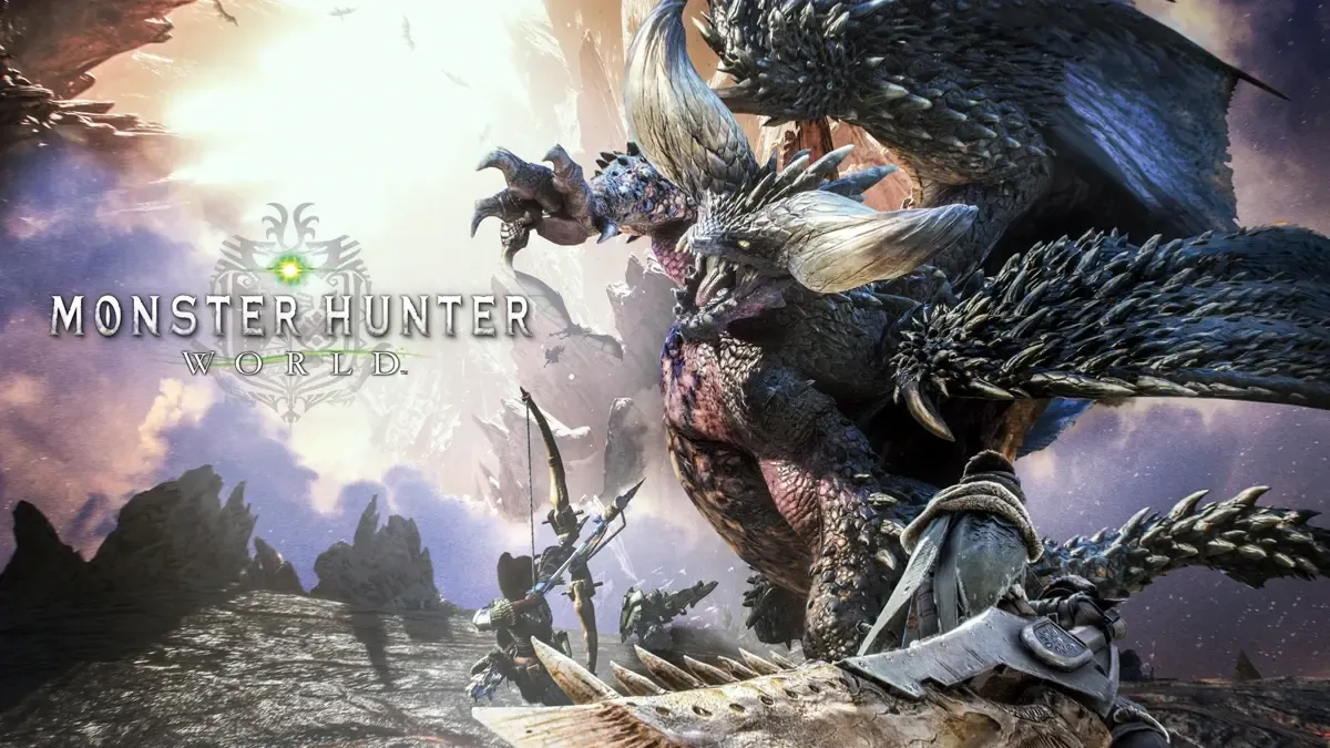
Monster Hunter World becomes Capcom's "best-selling single title of all time", sells 30m copies
Monster Hunter: World has sold like hotcakes.